


Top How-tos
-
This is Why the Android 15 Update Isn't So Important
-
Google TV for iPhone and Apple Users - Key Differences from Apple TV
-
Reply to messages without your phone - With your watch
-
Watch Out for Old Mobiles
-
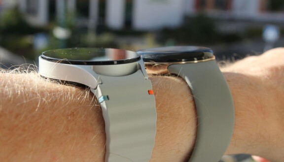
Pixel Watch 3 or Galaxy Watch 7: Which One has the best user interface?
-
How to Use Google TV with VPN
-
What are the pros and cons of a compact mobile?
-
Samsung Galaxy S25 now in store - First test of new call recording feature
-
Is Pixel 9 a good choice for those who prefer a small and handy Android phone?
-
Buyers Guide: Best choice for small, compact phones


100 latest articles
-
Review: Xiaomi 17 - Surprising camera phone
-
Review: Google Pixel 10a - Google's most affordable mobile
-
Review: Cheap headphones deliver top class - Huawei Freebuds Pro 5
-
Review: Xiaomi Watch 5 - Superior smartwatch with Wear OS
-
Review: Nothing Phone 4a - A phone that makes you happy
-
Review: Nothing Phone 4a Pro - Charming mid-range mobile with more luxury and performance
-
Review: Motorola Moto Watch - Totally useless
-
Review: Samsung Galaxy Buds 4 Pro - World class
-
Review: Apple iPhone 17e - Cheap top model
-
Review: Samsung Galaxy S26 and S26 Plus
-
Review: Huawei Watch GT Runner 2 - Marathon and more
-
Review: Samsung Galaxy S26 Ultra - Most versatile
-
Review: Nothing Headphone A - Cheaper and charming headphones
-
Review: Motorola Signature - More prestige
-
Review: Oppo Find X9 Pro - Top class
-
Review: Honor Magic 8 Pro - Sharp top model changes the game
-
Review: Xiaomi 17 Ultra - Superior camera phone
-
Review: Xplora One - Good children's mobile for parents who want to keep track
-
Review: Oneplus 15 - Magnificent
-
Review: Xiaomi 15T Pro - Flagship at a low price
-
Review: Oppo Find X9 - Oppo's first flagship now in Sweden
-
Review: Motorola Edge 70 - Thin and durable with few compromises
-
Review: Garmin Venu 4 - Both smartwatch and sports watch
-
Review: Honor Magic V5 - Powerful
-
Review: Garmin Instinct Crossover Amoled - Charismatic training watch with real hands
-
Review: Apple Watch SE 3 - An affordable Apple Watch that can
-
Review: Apple Watch Series 11 - Long-term improvement
-
Review: Apple Airpods Pro 3 - Finally!
-
Review: Samsung Galaxy S25 FE - Really affordable top mobile
-
Review: Motorola Razr 60 - The only affordable foldable mobile
-
Review: Xiaomi Watch S4 41 mm - appearance above all
-
Review: Oppo Reno 14 - First review
-
Review: Google Pixel 10 Pro Fold - Foldable, heavy and durable
-
Review: Sony Xperia 10 VII - Compact mid-range mobile
-
Review: Google Pixel Watch 4 - Should impress
-
Review: Apple iPhone 17 - The best choice
-
Review: Huawei Freebuds 7i - Offers possibilities
-
Review: Apple iPhone 17 Pro - The one you should upgrade to
-
Review: Apple Iphone Air - Alike and unique
-
Review: Samsung Galaxy A17 - Affordable phone with top screen and longevity
-
Review: Huawei Watch GT 6 Pro - Enhanced multitasker
-
Review: Nothing Ear 3 - Great-sounding headset with charm and quality
-
Review: Xiaomi Poco F7 - Top model for under 5000 kronor
-
Airpods Pro 3 packed with new features
-
The new Apple Watch models - all three with 5G and new health measurement
-
Iphone 17 and Iphone Air launched
-
Everything You Need to Know About the New iPhone 17 Pro and iPhone 17 Pro Max
-
Review: Samsung Galaxy Tab S11 - Luxurious tablet that lasts long
-
Review: Oneplus Buds 4 - Headset with fantastic noise cancellation
-
Review: Garmin Forerunner 970 - Packed with professional insights
-
Review: Google Pixel 10 - Top model with thoughtful compromises
-
Review: Oneplus Nord CE5 - Really cheap smartphone
-
Column: This is why we can expect a new Windows phone
-
Review: Honor Magic 7 Lite - Luxurious mid-range phone that can take a beating
-
Review: Oneplus Nord 5 - Sufficient and good
-
Review: Xiaomi Redmi A5 - How good is the phone for 1300 kronor
-
Review: Oneplus Pad Lite - A lot of tablet for under 3000 kronor
-
Review: Samsung Galaxy Watch 8 Classic - Luxurious and Polished
-
Review: Nothing CMF Watch 3 Pro - Really good smartwatch for only 120 EUR
-
Review: Samsung Galaxy Z Flip 7 FE - A cheaper foldable
-
Review: Samsung Galaxy Z Flip 7 - Subtly better
-
Review: Motorola Moto Watch Fit - Smartwatch under 100 EUR
-
Review: Samsung Galaxy Watch 8
-
Review: Nothing Headphones 1 - Stylish
-
Review: Samsung Galaxy Z Fold 7 - Generational Shift
-
Review: Garmin Venu X1 - Luxury watch with large screen
-
Review: Nothing Phone 3 - Charming and affordable top model
-
Review: Oneplus Pad 3 - Large tablet
-
Review: Honor Magic 7 Pro - Worthy Return with Class in the Cameras
-
Review: Motorola Edge 60 Pro - Slim mix
-
This could happen when Telenor buys Three Sweden - coverage, prices, competition
-
Review: Samsung Galaxy Tab S10 FE Plus - Tablet with a large screen and a slightly lower price
-
Here is the Android phone that works with Apple Watch and other Apple products
-
"Telenor wants to buy Three Sweden - ready to merge"
-
BankID gets a new widget - This is how to use it
-
Galaxy Watch 8 Classic appears on eBay
-
Here are the news in IOS 26 - New design at the centre
-
Review: Garmin Vivoactive 6 - A smartwatch just the way I want it
-
Review: Honor Magic V3 - Class difference
-
Sony stops its own mobile manufacturing
-
Nothing scraps Glyph lighting
-
Review: Sony Xperia 1 VII - Best in its own way
-
Column: Sony's journey from largest to non-existent
-
New Design: Here Are the Updates in Android 16
-
Samsung Galaxy S25 gets Android 16 this summer
-
Review: Nothing CMF Phone 2 Pro - The best mobile you can get for 300 euro
-
Review: Huawei Watch Fit 4 Pro - Thin and light, yet powerful and versatile
-
Review: Sony WH-1000XM6 - The best has become better
-
Acer introduces smart ring
-
Better alternatives to Shazam: Hum, sing yourself or play music and the app will tell you the song title and artist
-
Sony Xperia 1 VII: Official with several camera updates
-
Review: Motorola Razr 60 Ultra - Versatile foldable with style
-
Review: Motorola Edge 60 - Elegant mid-range phone with good cameras
-
Review: Samsung Galaxy S25 Edge - Thin with fewer compromises than expected
-
Samsung invites you to the Galaxy S25 Edge launch
-
Review: Motorola Edge 60 Fusion - Affordable luxury
-
Samsung launches new payment feature
-
Tap to Pay now with Paypal on iPhone
-
Ikea and Sonos Part Ways
-
IOS 18.5 and Watch OS 11.5 on the way - new features and Apple's new Pride collection
-
Several Mobile Manufacturers May Leave Google
-
Apple is working on a new operating system
-
Major Leak About Galaxy S25 Edge
-
Google has removed almost half of all apps
-
Sweden misses out on Oneplus 13T
-
Banking app Revolut becomes a mobile operator
-
Why So Many Use Google's Search Engine
-
Meta's AI app launched for iPhone and iPad - Creates images and provides answers
-
Wild Rumour: This is How Thin the Galaxy Z Fold 7 Can Be
-
The next top chip Snapdragon 8 Elite 2 may arrive earlier than expected
-
Review: Ulefone Armor 28 Ultra - Rugged monster phone with everything extra
-
Soon Google may back up your mobile number
-
Samsung prepares for new Galaxy Watch Ultra
-
Android 16 to be showcased on its own Google show in May
-
Google scraps Maps feature for drivers
-
Nothing launched the super affordable CMF Phone 2 Pro and three headsets
-
The AI company wants to track everything you do
-
Earn money from illegal parking
-
Yahoo too wants to buy Chrome
-
Bargain Review: Motorola Moto G85 - Now Really Good Value
-
Motorola Razr 60 and Razr 60 Ultra - First impression
-
Another AI company wants to buy Chrome
-
Here are Motorola Edge 60 Pro and Edge 60 - now official
-
Here is Motorola's smartwatch and new glitter earphones: Motorola Watch Fit and Buds Loop
-
Review: Sony WF-C710N - Compact, good-sounding mid-range headphones
-
OpenAI wants to buy the browser Chrome
-
Iphone 17e is said to be approaching test production
-
Google pays Samsung for Gemini
-
DHgate - this is what you need to know about the new top app
-
Find out what the internet says about you - free service can find and delete information
-
Review: Xiaomi Poco F7 Pro - Top phone at a mid-range price
-
Thanks for Everything, Android 12 - No Longer Receiving Updates
-
New Galaxy Mobile with Removable Battery
-
This is what Apple's photo search with AI can do - gets help from Google and Chat GPT
-
Leak reveals Pixel Watch 4
-
Review: Samsung Galaxy Tab S10 FE - Not the one you think
-
Samsung One UI 7: "Rollout paused globally after bug discovered"
-
Review: Xiaomi Poco F7 Ultra - Super cheap top mobile
-
Review: Google Pixel 9a - Cheaper phone with surprisingly few drawbacks
-
Three Sweden seeks merger with one of the Swedish competitors
-
Popular Samsung Phones Retire
-
Open beta of Android 16 from Oneplus
-
Now Google Gemini is aware of the surroundings
-
Samsung has released a schedule for the rollout of One UI 7 for more phones
-
iPhone to Celebrate 20th Anniversary in Grand Style
-
How to customise notifications and quick settings in Samsung's One UI 7
-
AI issue causes ripple effects for Apple
-
Samsung's next foldable launches with Android 16
-
Alternative to American Cloud Storage Giants: Icedrive
-
Tips: Display and control your Xiaomi phone's screen on your Mac


Annonsinnehåll:


-
PLUS
Krönika: Nästa steg är inte ett utan flera
-
PLUS
Fördjupning: Oneplus nedläggning – det här händer nu
-
PLUS
Enklare än någonsin byta bort Google – Tips, skälen och sökmotorerna du kan välja istället
-
PLUS
Krönika: One UI, Color OS, Oxygen och de andra
-
PLUS
Gemini i äldre högtalare, Instagrams betalabonnemang, Android 17 när och mer – Mobilredaktionen svarar
-
PLUS
Krönika: Android 17 förbättrade multitasking mer än vikbara telefoner någonsin gjort
-
PLUS
Guide till Gemini for Home - smartare assistent i smarta hemmet
-
PLUS
Så får du nytta av nyheterna i Samsungs One UI 8.5, Del 2
-
PLUS
Krönika: Smarta högtalare tar mig på en berg och dalbane-tur
-
PLUS
Apples lansering i detalj – det ger nya IOS och detta saknas


Ad